Empowering Youth Through Stock Market Education
Empowering Youth Through Stock Market Education
Empowering Youth Through Stock Market Education

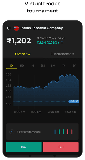
StockPe is a great way for youngsters to learn about the investing in stock market. It is free to use and does not require any prior experience with the stock market.
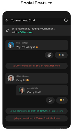
To address the gap in financial literacy among young individuals, we designed for Stockpe, a gamified learning platform that demystifies stock market investing. By combining engaging interactive elements with comprehensive educational content by extensive research methods & UI design for website & mobile application.


Scope of Work
Scope of Work
Scope of Work

UX Research
& Discovery
UX Research
& Discovery
Focused on gaining a deep understanding of our target customers, their needs, and their expectations. Evaluating our existing product and analyzing the competitive landscape, we were able to identify areas for improvement and develop a roadmap.
Focused on gaining a deep understanding of our target customers, their needs, and their expectations. Evaluating our existing product and analyzing the competitive landscape, we were able to identify areas for improvement and develop a roadmap.

Fix Fundamental &
Legacy issues
Fix Fundamental &
Legacy issues
Identifying and addressing fundamental and legacy issues. By conducting thorough usability testing and analyzing user feedback, we were able to pinpoint areas that needed improvement and develop strategies to enhance the overall user experience.
Identifying and addressing fundamental and legacy issues. By conducting thorough usability testing and analyzing user feedback, we were able to pinpoint areas that needed improvement and develop strategies to enhance the overall user experience.

Framework
Design
Framework
Design
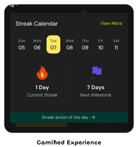
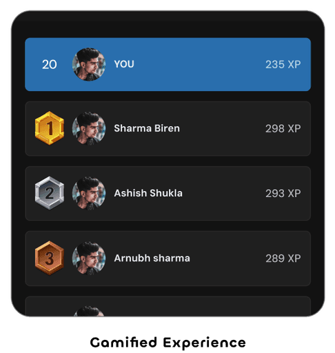
Designed a framework to enhance user engagement. Developed a gamification strategy, streamlined user flows, implemented a rewarding badging system, clear level progression, and integrated product elements for a cohesive experience.
Designed a framework to enhance user engagement. Developed a gamification strategy, streamlined user flows, implemented a rewarding badging system, clear level progression, and integrated product elements for a cohesive experience.
Project Goal
Project Goal
Project Goal
Influence
Next Generation
Influence
Next Generation
Strengthen
Achivr Community
Strengthen
Achivr Community
Boost
Conversion Rates
Boost
Conversion Rates
Enhance
User Experience
Enhance
User Experience
The Challenge
The Challenge
The Challenge
Many young individuals tend to shy away from learning about the investing due to its perceived complexity and lack of engagement. Due to limited resources, which often come in boring and lengthy formats. The extensive time required to grasp the content and the absence of a well-structured learning path contribute to the challenges. How might we create an engaging and intuitive mobile app experience that simplifies complex financial concepts, making investing accessible and enjoyable for young adults?
Many young individuals tend to shy away from learning about the investing due to its perceived complexity and lack of engagement. Due to limited resources, which often come in boring and lengthy formats. The extensive time required to grasp the content and the absence of a well-structured learning path contribute to the challenges. How might we create an engaging and intuitive mobile app experience that simplifies complex financial concepts, making investing accessible and enjoyable for young adults?
Project Duration :
Project Duration
8 MONTHS
8 MONTHS
Screens Delivered :
Screens Delivered
200+
200+
The Approach
The
Approach
We adopted an agile methodology, working in 15-day sprints to rapidly iterate on StockPe. Our design process commenced with robust user research, encompassing primary and secondary data collection. Through empathy mapping and affinity diagramming, we delved deep into user needs and pain points. Competitive analysis and user journey mapping informed the ideation phase, where we generated innovative solutions through brainstorming and crazy eights. We then translated these ideas into user flows, wireframes, and high-fidelity prototypes, ensuring a seamless user experience.
We adopted an agile methodology, working in 15-day sprints to rapidly iterate on StockPe. Our design process commenced with robust user research, encompassing primary and secondary data collection. Through empathy mapping and affinity diagramming, we delved deep into user needs and pain points. Competitive analysis and user journey mapping informed the ideation phase, where we generated innovative solutions through brainstorming and crazy eights. We then translated these ideas into user flows, wireframes, and high-fidelity prototypes, ensuring a seamless user experience.

Understand
Identify Pain Points, Competitor Research

Define
Affinity Mapping, User Journey Mapping, Story Boarding

Ideate
How might We, Crazy 8s, Strategy Maps, User Flows
Deliver
Low fidelity Wire-framing & Prototypes

StockPe Design Interventions
StockPe Design
Interventions
Challenge 01
User drop-offs right after installation
User drop-offs right after installation
After installation of the StockPe app, there were instances of users either dropping off or not signing in promptly. This phenomenon suggests a potential engagement or onboarding challenge that we aim to address and understand better. In the subsequent analysis, we explore the factors contributing to user drop-offs and delayed sign-ins to improve the app's initial user experience.
After installation of the StockPe app, there were instances of users either dropping off or not signing in promptly. This phenomenon suggests a potential engagement or onboarding challenge that we aim to address and understand better. In the subsequent analysis, we explore the factors contributing to user drop-offs and delayed sign-ins to improve the app's initial user experience.
The initial onboarding lacked visual appeal and failed to clearly communicate the product's overall value. Users were frustrated by the excessive number of steps before reaching the account creation stage.
The initial onboarding lacked visual appeal and failed to clearly communicate the product's overall value. Users were frustrated by the excessive number of steps before reaching the account creation stage.
The initial onboarding lacked visual appeal and failed to clearly communicate the product's overall value. Users were frustrated by the excessive number of steps before reaching the account creation stage.
Only
Only
33% Users
33% Users
33% Users
To Sign Up
To Sign Up
To Sign Up
Progressed
Progressed
Progressed
Screen
Screen
Screen

Earlier approach
Earlier approach
Earlier approach
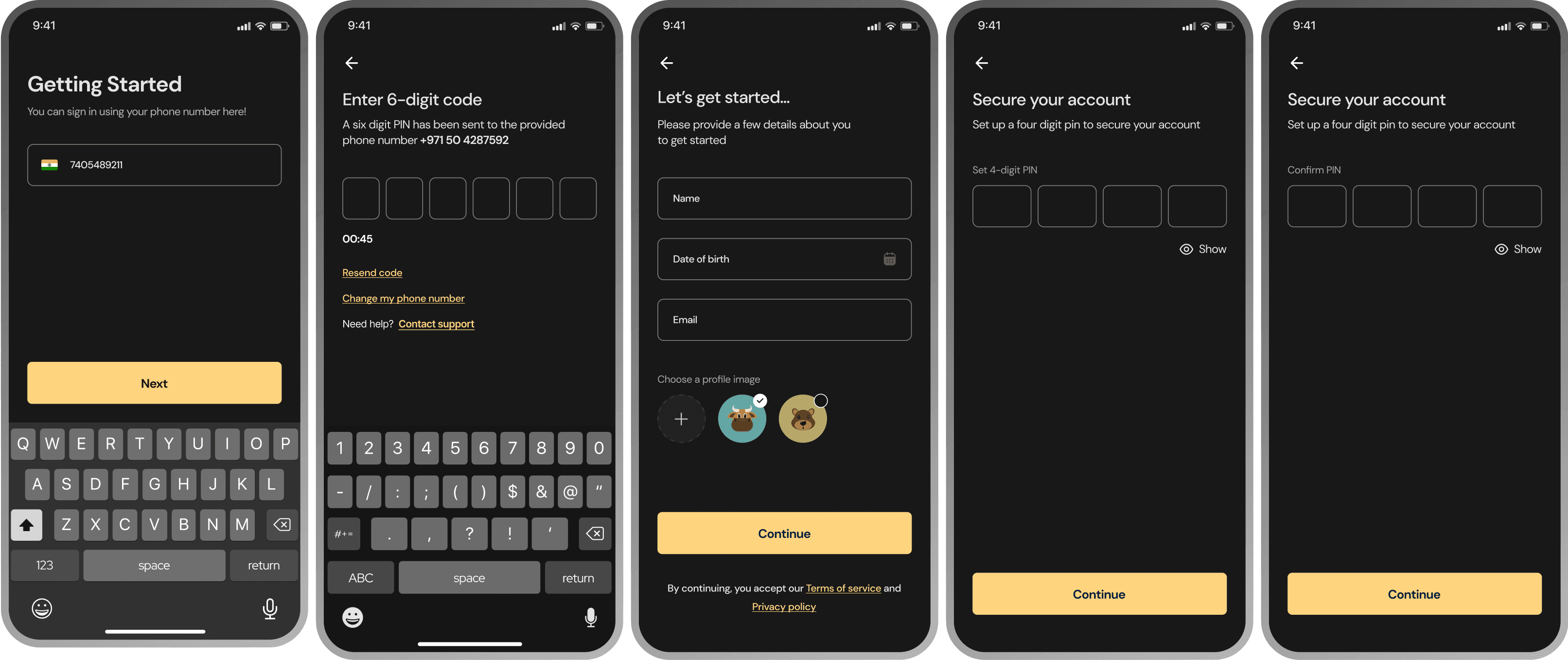
The onboarding process was overly complex with an excessive number of steps. Additionally, users lacked visibility into the process's progress, leading to confusion. The flow of the onboarding journey did not align with users' expectations, resulting in a disjointed experience.
The onboarding process was overly complex with an excessive number of steps. Additionally, users lacked visibility into the process's progress, leading to confusion. The flow of the onboarding journey did not align with users' expectations, resulting in a disjointed experience.
New approach
New approach
New approach
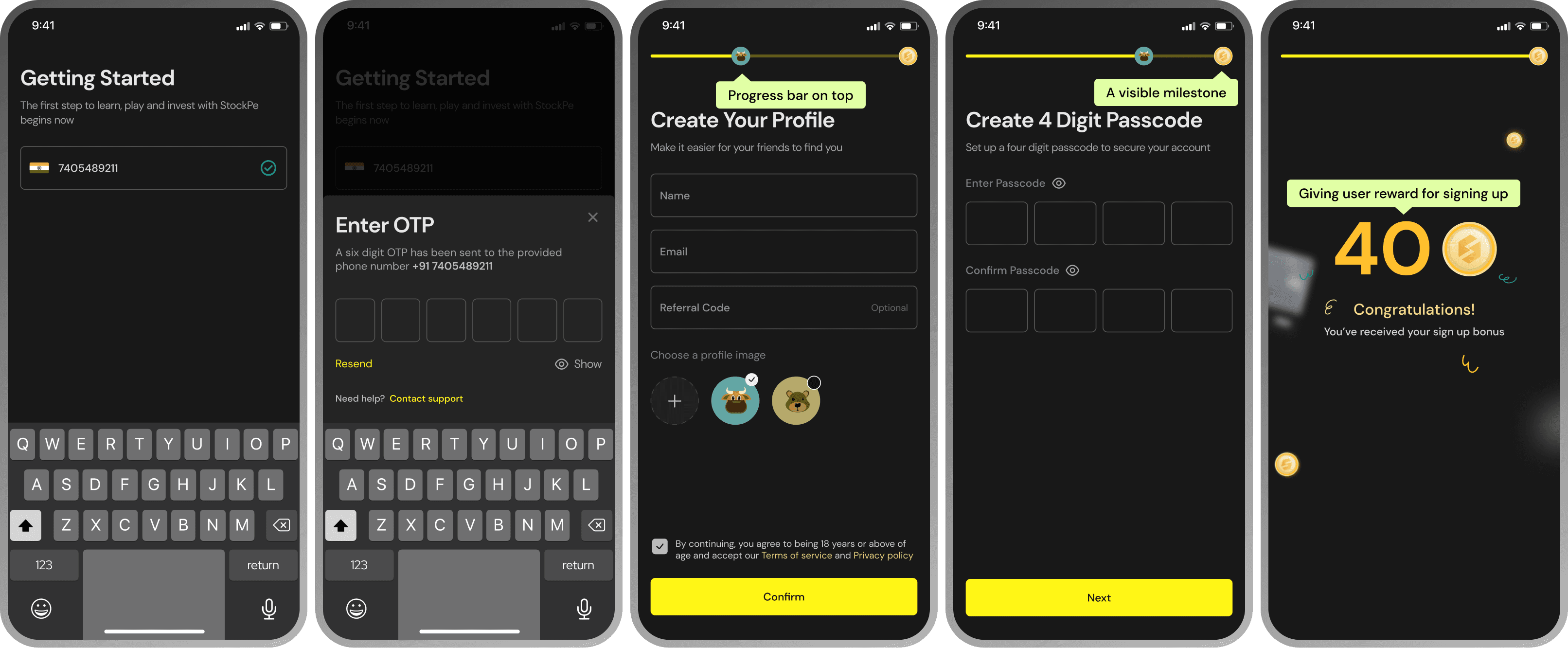
To improve user experience, we implemented a clear progress indicator, providing users with visibility into their journey. Micro-animations were incorporated to enhance engagement. Additionally, a signup bonus was introduced to incentivise account creation and foster user loyalty.
To improve user experience, we implemented a clear progress indicator, providing users with visibility into their journey. Micro-animations were incorporated to enhance engagement. Additionally, a signup bonus was introduced to incentivise account creation and foster user loyalty.
We implemented a progress indicator resembling Instagram Stories to streamline the onboarding process. Each step highlighted the product's value proposition, encouraging user engagement. By offering a clear CTA to start, we reduced the time to account creation. Users could either explore product benefits or proceed directly to sign up.
We implemented a progress indicator resembling Instagram Stories to streamline the onboarding process. Each step highlighted the product's value proposition, encouraging user engagement. By offering a clear CTA to start, we reduced the time to account creation. Users could either explore product benefits or proceed directly to sign up.
We implemented a progress indicator resembling Instagram Stories to streamline the onboarding process. Each step highlighted the product's value proposition, encouraging user engagement. By offering a clear CTA to start, we reduced the time to account creation. Users could either explore product benefits or proceed directly to sign up.
To
To
71% Users
71% Users
71% Users
To Sign Up
To Sign Up
To Sign Up
Progressed
Progressed
Progressed
Screen
Screen
Screen
Challenge 02
Ticket size in tournaments were decreasing
Ticket size in tournaments were decreasing
The number of players in the tournaments were decreasing day after day and the active people on the app were slowly declining. After research and studying the data we came to the conclusion that users were withdrawing their earnings from the wallet and since there was traction in depositing money in wallet, users would not do that.
The number of players in the tournaments were decreasing day after day and the active people on the app were slowly declining. After research and studying the data we came to the conclusion that users were withdrawing their earnings from the wallet and since there was traction in depositing money in wallet, users would not do that.
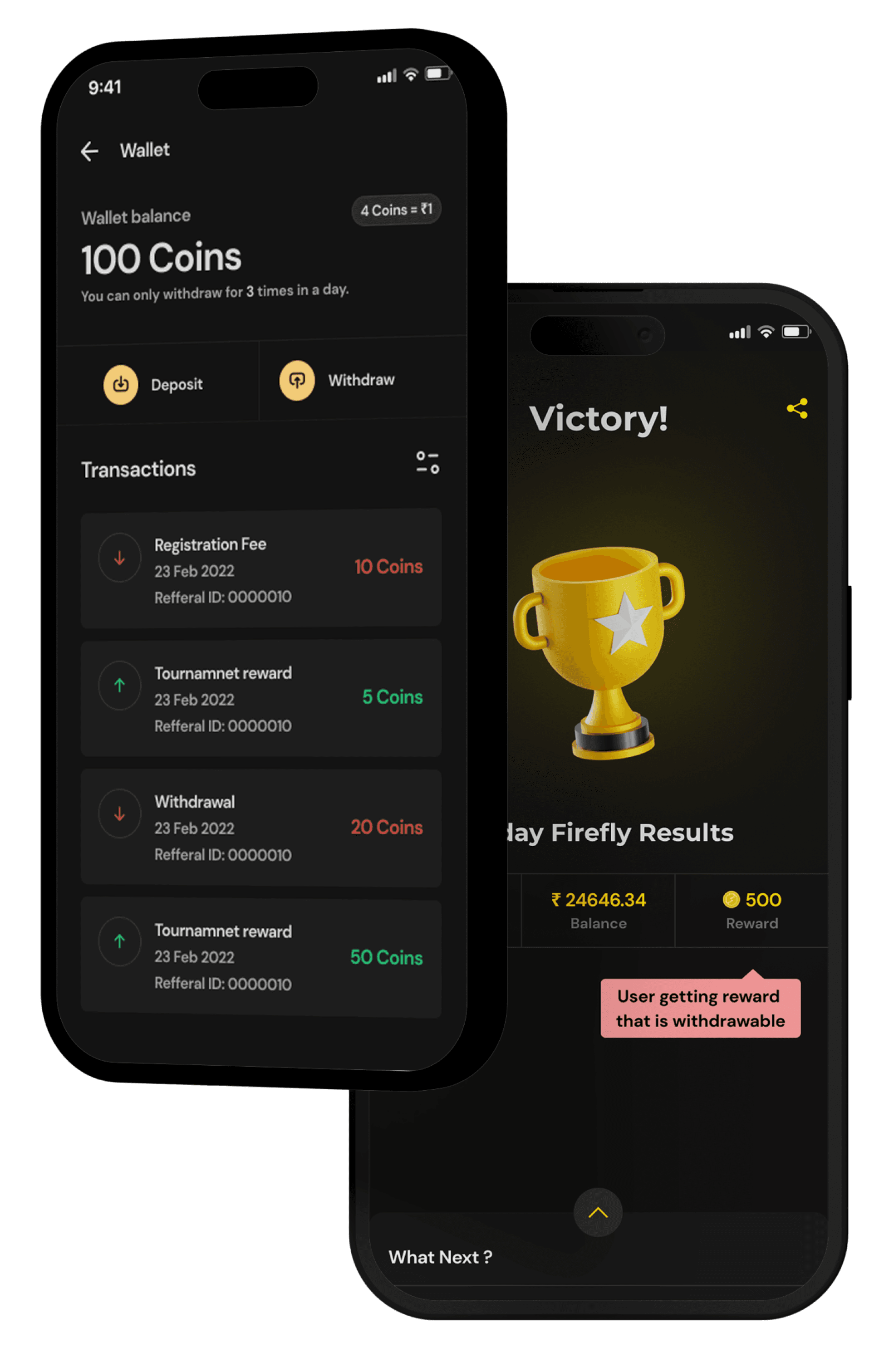
Previously, users could easily withdraw cash prizes without engaging further with the platform. This unrestricted withdrawal mechanism led to a significant loss of active users, impacting overall customer retention.
Previously, users could easily withdraw cash prizes without engaging further with the platform. This unrestricted withdrawal mechanism led to a significant loss of active users, impacting overall customer retention.
Previously, users could easily withdraw cash prizes without engaging further with the platform. This unrestricted withdrawal mechanism led to a significant loss of active users, impacting overall customer retention.
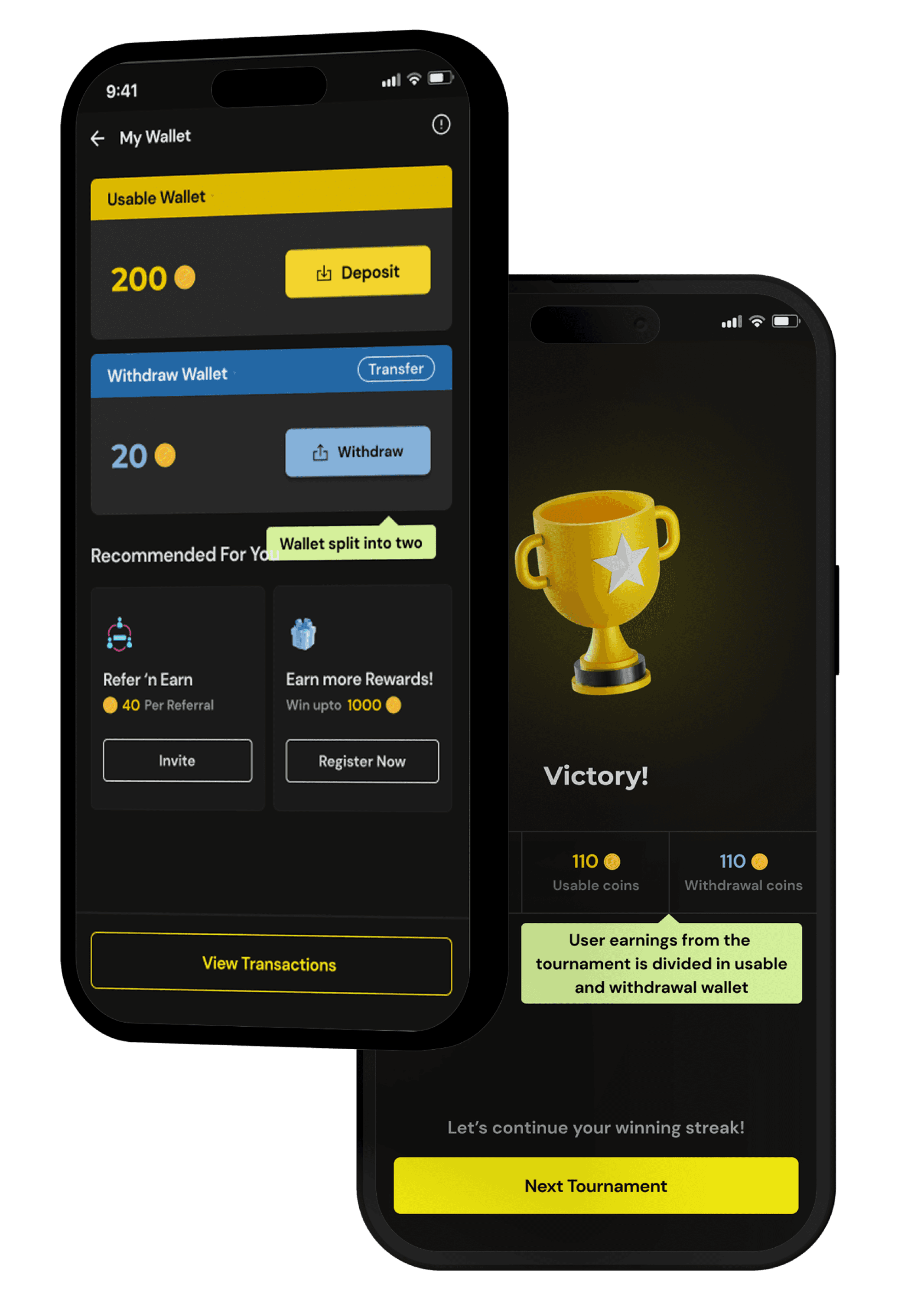
By restricting deposited funds to in-app transactions like tournaments, we aim to increase user engagement and retention. This strategy ensures users consistently maintain a usable balance within the app, promoting continued participation and potentially higher spending.
By restricting deposited funds to in-app transactions like tournaments, we aim to increase user engagement and retention. This strategy ensures users consistently maintain a usable balance within the app, promoting continued participation and potentially higher spending.
By restricting deposited funds to in-app transactions like tournaments, we aim to increase user engagement and retention. This strategy ensures users consistently maintain a usable balance within the app, promoting continued participation and potentially higher spending.
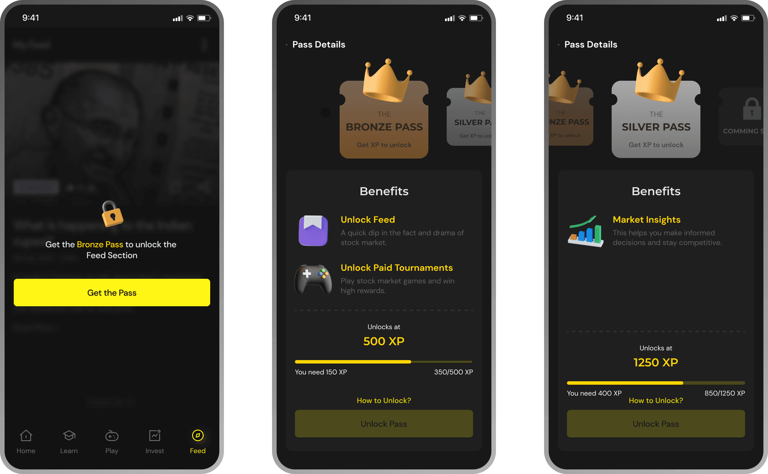
Challenge 03
The app was too overwhelming for new users & not exciting for existing users.
The app was too overwhelming for new users & not exciting for existing users.
While researching about this problem we found out that since the app had lot to offer, it would get overwhelming for users when they first arrive (which was one of the original problem- complexity).
To address this issue we decided to create a locking mechanism that would lock certain features of the app and as the user gains XP points the app can be unlocked using the XPs.